Subscription Box Workflow Redesign
Improving box quality for retail customers

OBJECTIVE: Redesign the workflow for stylists to “pause” a box of clothing that they are working on. For a variety of reasons, a box may need more time and attention from other stakeholders to ensure customers receive high quality boxes.
MOTIVATION: A significant amount of boxes were sent to the wrong department for review or did not need to be paused in the first place.
MY ROLE: Researcher & Product Designer
MY ACTIVITIES: Requirement Gathering & Analysis, User Interviews, User Flows, UX / UI, Story Grooming
IMPACT: In a post design survey, majority of stylists could discern between when they needed to pause vs finish a box.
1 - Help me, I’m lost
Dia is a subscription box company that sends 5 items to a customer to try on at home before purchasing. When a stylist feels that she cannot style the box for one reason or another, she must “pause the box”. In other words, the box is sent to either a styling team lead or customer service to determine how to resolve the issues with the box.
Within the styling tool, the pause box workflow did not provide any guidance on how to handle a box that might need to be paused. That resulted in stylists sending boxes to the wrong queues or sometimes finishing a box that should have been paused.
TL;DR The UI did not help stylists determine the correct reason to pause a box.

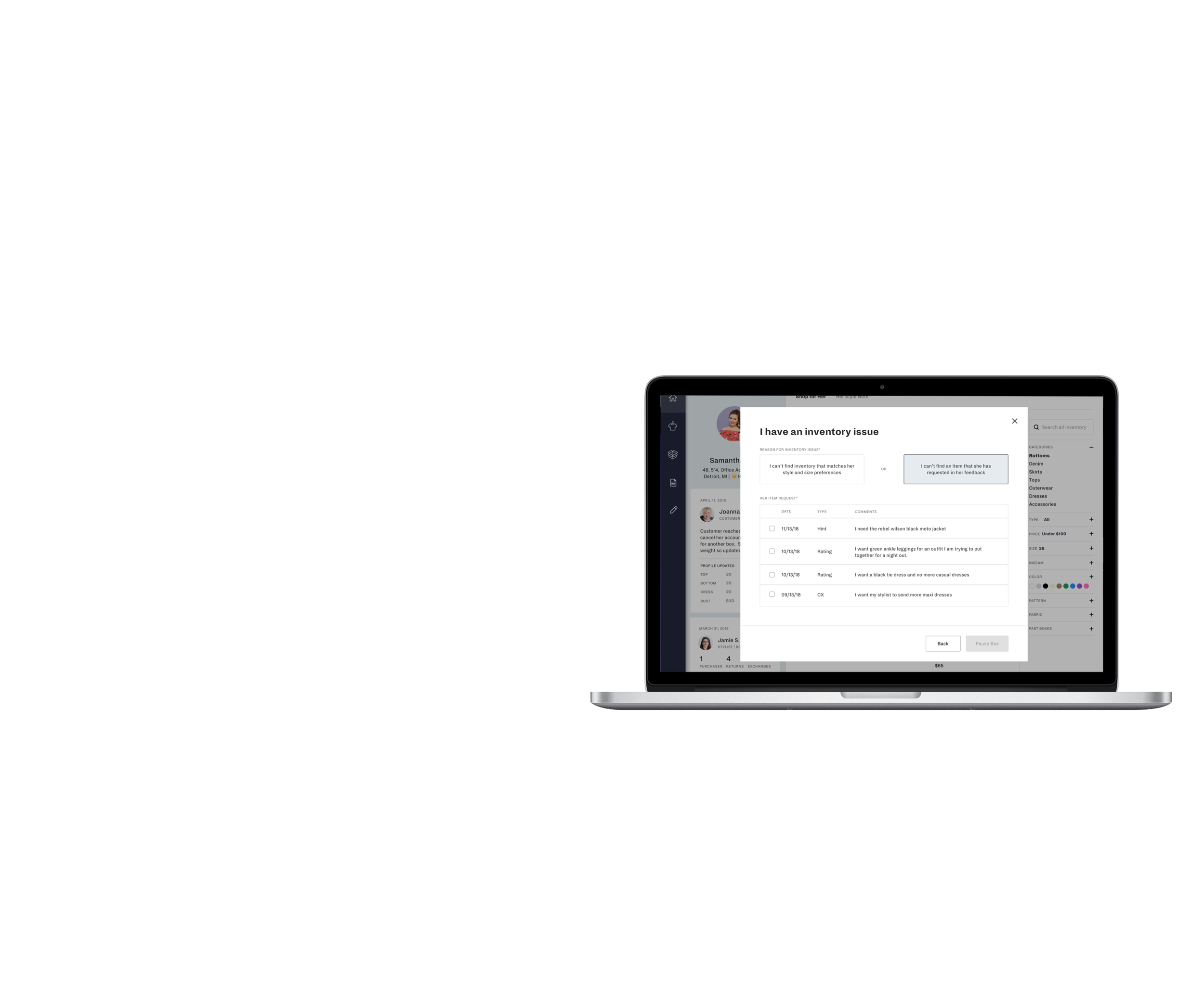
Styling Tool - Pause Box for Inventory Reasons
2 - The User Struggle
I used research provided from another designer and supplemented my own learnings by conducting user interviews to better understand the current pain points. To begin, I focused on the different “users”:
the customer (recipient of the box)
the stylist (styles the box)
the styling lead or customer service (admin that resolves issues with the box before sending it to the customer)
the CUSTOMER’s pain points
Unaware that their box is paused
Not informed why their box is delayed or late due to a pause
THe STYLIST’S PAIN POINTS
Unsure of when they should pause a box
Unsure of when they should complete a box and email customer service for additional support
Unsure of the process that occurs after they pause a box
Assumes that customers receive better service when a box is paused, which increases the incentive to pause
The admin’s pain points
Receives boxes that should be worked by another department (typically by styling leads)
Unable to move a box to the correct queue
Increased resolution time of boxes in the wrong queue
Receives boxes without much detail on why the box was paused
Sends back multiple boxes at a time to stylists because they don’t require individual investigation (no messaging is sent back to the stylists to confirm that admin has purposefully restarted the box and effectively, “unpaused” it, so sometimes a stylist will re-pause the box)
TL;DR There was a lack of communication between each user type resulting in longer wait times for customers and slower productivity for the admin team.

Documented the flow between styling and admin that helped illuminate the issues that occur between the two
3 - Design Iterations
There were many pain points to digest, but with all projects, you need to scope out the most important pain points where you can make an impact.
key focus areas
Improving the UI in the styling tool so stylists understood the difference between each queue
Increasing the amount of information required for stylists to send to admin, so admin could resolve issues faster
4 queues for paused boxes:
Account Information
Schedule Conflict
Inventory
Needs QC
The stylists have training materials on these queues outside of the styling tool but as you can see below, there are no hints within the tool.

Pause Box Modal - Default

Pause Box Modal - Reason Selected
I immediately wanted to add more context to the UI. With there being 4 queues, a quadrant kept coming to mind. From there, I made the inventory queue names more clear as to what they represent from the perspective of the stylist and added more context of what they meant.

V1 of pause box landing screen
Initially, I felt encouraged by this design, but as I continued to review the training documentation that stylists received, I realized I was missing a really important step. In certain scenarios, a stylist can actually finish a box and then email customer service to reach out to the customer (the email address and process was documented within the training materials, but not included at all in the UI).
There was an automated feature outside of the styling tool that allowed a stylist could escalate an issue to customer service without pausing the box, but when I tried to get it moved into the styling tool, its implementation was de-prioritized. If I couldn’t automate the escalation process for stylists, I would need have the UI explain the two possible paths (finish a box vs pause a box).
Time to pivot…
Before presenting the 4 queues, I would ask the stylist if they needed to pause the box. If they indicated they could not move forward, I would send them to the quadrant view. If they could finish the box but just needed customer service to be aware of something, I would show them the customer service process.
TL;DR The UI was redesigned to provide explanatory copy to help a stylist determine whether or not they needed to pause a box before providing them with the 4 possible pause queues.

V2 of pause box landing screen
3 - Don't Assume - Test!
At this point, I was feeling pretty good about the design after I reviewed them with key business stakeholders.
It is simpler! It is easier to determine which path to take!
The designs were approved by styling leadership, but they didn’t use the styling tool to the extent that stylists did. The designs also were approved by the customer service team because they think in terms of queues and felt that the designs provided enough context. Ultimately, I needed to know if these designs worked well for the stylists.
I was constrained to one more week of design on the project before I had to move on. I needed a quick way to get feedback, so I decided on a survey rather than a full prototype and discussion guide. To get the depth of answers I would from a prototype, I honed in on the possible use cases that a stylist could encounter and gave them 5 multiple choice options — the 5 different paths you could take in the new designs.

Survey sent to stylists.. received over 150 responses in 2 days

The results changed the course of my design. The main takeaway was that stylists still did not know whether or not they needed to pause a box even though I had added a sentence describing the purpose of each queue.
4 - Refine the Design
I removed the explanatory sentences and listed out each possible reason that you could select a particular queue. Now, no interpretation or memory is needed for a stylist.

V3 (Final) of pause box landing screen
5 - Finishing the workflow
While I was working on the landing screen for paused boxes, I had defined the rest of the screens that would happen afterwards to ensure it all flowed properly. One of my key focus areas was that stylists did not provide enough information to admin and the UI didn’t help guide the stylists. Admin wants as much detail as possible so they can reduce going back and forth with the stylist via email or slack. So i thought… what if there was a way to directly take the feedback from a customer and send it to admin? There would be less work required from the stylist to interpret or re-write what the customer said and all of the provided information would be at the hands of the admin team.
I worked with my engineering team to determine if this was feasible. There were 3 different data sources that could contain feedback from a customer. It was difficult, but it could be done, so I set off to design the UI to support my feature request.


And for scenarios in which there wasn’t free form text commentary from a customer, we provided dropdown menus to ask for key information.


With the paused box flow redesigned and tested, I had to make minor updates to the admin tool to be able to reflect the new information coming in from the styling tool. But, one piece of the puzzle was still missing… the communication back to stylists when their leads restart multiple boxes at one time without any explanation.

The stylists have a dashboard that they view before they style boxes. To me, it made sense to alert them that they had a box that had been reviewed by a lead and determined that it was able to be styled. I had to balance the amount of information communicated to them on the dashboard and within the tool.