Retail Assortment Tool Redesign
Redesigning a retail assortment tool

OBJECTIVE: Increase adoption of an internal tool that consultants use to increase the sales and profits of retail clients for a consulting firm with over 16,000 employees and $6 billion in revenue. Eventually, sell the tool directly to retail clients.
MOTIVATION: Without a clearer vision of the product roadmap and an improved UX/UI, funding would be pulled from the project.
MY ROLE: Lead UX/UI Designer
MY ACTIVITIES: Heuristic Analysis, Strategic Conversations - User Interviews & Design Approvals, UX / UI, Support Agile Development
IMPACT: Received an additional 4 months of funding to continue building features based on excitement and confidence from the design refresh. Subscribed 3 more project teams to use the tool with their retail clients.
1- Shifting the Problem Focus
The client had a VERY negative experience with their previous vendors and really wanted to see what we could do to improve their current situation. Initially, I was asked to make everything as flexible and configurable as possible... which is A) not an easy feat B) a larger undertaking than they realized with our limited budget.
So I reframed the ask.
Why do we want to make everything as flexible and configurable as possible? Because consultants work long weeks and need everything we can provide to make their experience as easy as possible. Okay, since we need to take all of this work in chunks, I can start with improving the current experience of the app.
What is one key piece of feedback that you routinely hear from consultants? The app doesn't have what they need, they don't know how to use it without asking a customer success manager a lot of questions, and there are too many features on the page.
Now I could get to work.
2 - Analyzing the App
Initially, improving app performance was the primary concern of the project team, so I had flexibility in terms of the work I wanted to start. Now that I reframed the ask, I felt that a heuristic analysis would be a great way for me to:
- Learn how to use the tool
- Identify epics for my design sprints
- Pitch the need for a style guide

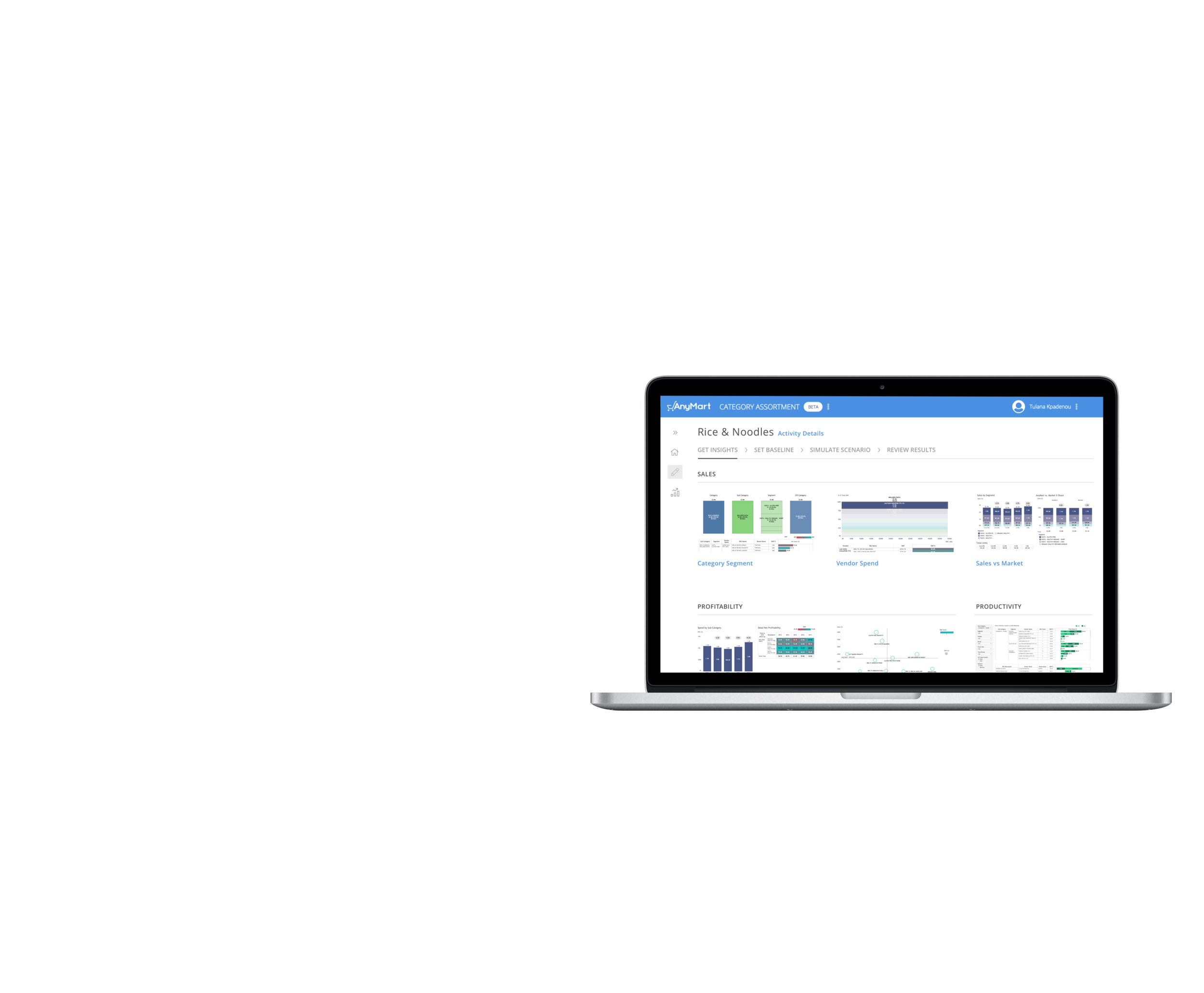
Core Page in App - Here, you can add, remove, and keep SKUs in your assortment before simulating a scenario
I examined the components on the page, clicked through each function I could find (many were hidden unless you hovered over them), analyzed user flows, and even reviewed verbiage.

As a first time user of the app, it was quite difficult to understand why certain features were built or how I was supposed to use them. As I completed my analysis, I started to group my notes based on common themes, which eventually led to the most critical insights:
Main Takeaways
- Lack of consistent styling
- Low visibility of functions
- Poor information architecture
- Lack of error prevention
- Component behavior did not follow best practices
3 - Empathizing with the User Struggle
The client was initially hesitant to allow me to interview their users. Their user base consisted of associates and consultants who work 80 hour weeks to provide insights to their retail clients about their product assortment based on data analysis. Each retail client had different data and requirements, which influenced the product team to build the app to be as configurable and flexible as possible. Unfortunately, that resulted in an app that had many features that were built and never used.
Even though it feels like every case team has unique tasks, I knew there had to be some overlap in the needs of the case team or else, they would not have been as efficient as they were prior to using the app. The consultants used 4 different programs to get their job done: Excel, Alteryx, Powerpoint, and Thinkcell. Our ultimate goal was to support all of those needs within the app we were building.
Pitching Strategic Conversations
To convince the team that I would not waste their consultants' time, I laid out my plan. I would interview consultants on 2-3 core features, two sprints prior to the engineering sprint to ensure designs had user feedback incorporated.
They agreed to my schedule, but then requested group interviews for me to talk to as many consultants as possible. I encouraged the product team to set up individual interviews because you can learn a lot more from having someone talk through and show you their unique way of completing a task.
realizing a sobering truth
As excited as I got about having client buy-in to my designs, I needed to have approval from the actual consultants using the tool. Many of the design changes that I made did not significantly improve a consultant's work flow because they ultimately needed core features integrated into the app such as tables with excel functionality, data visualization configuration, and more transparency around the algorithm producing the sales and profit numbers that they shared with clients. This was still very valuable information because it was used to help prioritize the product roadmap with the end goal of increasing user adoption.
4 - Redesigning Core Components Brick by Brick
The client moved very quickly to support their consultants, so I had to adjust to their working style. They were not interested in fancy decks or big presentations - they just wanted enough information to keep moving forward and they wanted it fast. To do this, I had to be flexible by:
- Gathering more business requirements from each design review
- Providing multiple design options with rationale
- Understanding that I needed to take small steps to get to the grand vision of the redesign

User can review changes made to assortment right before running a simulation
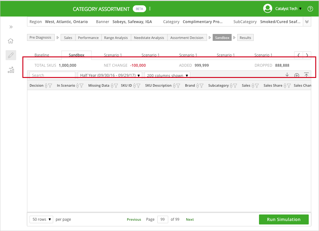
User must look at the top of page to review changes prior to running a simulation

Final Decision - Move assortment to bottom of page to aid in review prior to simulation.
Each sprint, I was able reduce the clutter of the app by learning which pieces of information on the screen are critical to know and which ones are sufficient to hide based off user interviews and business needs. This distinction helped me achieve the first goal of the project. Secondly, I improved the information architecture by:
- giving visual prominence to the category that the user is analyzing
- collapsing all of the sections that allow you to view visuals (sales, performance, etc.) into one section, so that the chevrons do not continue to grow horizontally as you add additional visuals
- collapsed the scenario tabs into a dropdown to reduce clutter and make it easier to find all of the scenarios that you have run
5 - Supporting Agile Development
I, along with the developers who worked in Lithuania, worked in 2 week sprints. I supported the team by contributing to daily standups, grooming JIRA stories, partnering with the Product Manager to plan sprints, and reviewing designs in the development environment to QA prior to sprint demos. To help visualize the final goal of 2 to 3 sprints worth of work, I created Invision prototypes to maintain alignment with both the developers and client stakeholders.