Online Banking Site Redesign
Improving an online banking experience

OBJECTIVE: Redesign the site to be responsive, reduce pain points, and attract new members for a credit union with over $9 billion in assets and over 385,000 members
MOTIVATION: The website had not received a full refresh in over a decade and there were an increasing number of complaints from members
MY ROLE: Research & UX Lead
MY ACTIVITIES: Requirement Gathering & Analysis, Site Map, User Research, Accessibility, UX / UI, Story Grooming
IMPACT: The designs went through two rounds of user testing and an accessibility check to significantly reduce the number of pain points reported. Our work received buy-in from the program sponsor and now is in development, slated for a 2019 release.
1 - It's Time for a Facelift
When I first saw our client's website, I could tell that it hadn't been updated in many years. 13 to be exact. It looked significantly dated compared to the sleek mobile app that they had released in 2016. We weren't just providing a facelift to the UI, but also tasked with creating an improved user experience.
TL;DR Make it usable rather than trendy.

2 - The User Struggle
Our client primarily catered to wealthy, older members who typically stored money in certificates of deposits with the credit union due to high returns. That being said, they also wanted to attract millennials into becoming long term customers. From interviewing and observing both groups of people during research (the details of which are further below), I had to balance the differing needs of both groups.
the older crowd
- Had one person in the household who typically handled all finances
- Had challenges with low vision, confusion, and findability
- Expressed interest in larger font, darker colors, and explicit messaging
- Valued long term relationships with their financial institutions and expressed nostalgia for in-person banking
THe younger crowd
- Were able to complete tasks quickly and share multiple ways to complete a task
- Expressed interest in trendy designs, but ultimately was less concerned with the design
- Valued financial institutions who would give them the best rewards and used mobile banking more often than the older crowd
3 - Comparing Competitors Across Key Areas
Competitive Analysis
We picked competing financial institutions who worked with our personas and posed a significant risk of attracting members from our client. We focused on five aspects of online banking:

From there, we analyzed different features, process flows, content, and design elements on other online banking platforms to gain insights that would influence the redesign.
3 - Keeping Track of the Nitty Gritty
After the competitive analysis, the client's business analyst sent over an excel document of over 300 requirements of the current site to be maintained for the redesign. In addition, I used 15 powerpoint decks with screenshots to "navigate" the system as I was not given access to any of the environments.
Information Architecture
One of the primary issues was that features were not contextualized to the appropriate account type or navigation item where a user would expect them to be. In the site map, I could visualize where the content lived in the current implementation and then make changes for the future state based on my assumptions of a user's mental model of where certain information should be located.
Proposed Information Architecture Changes
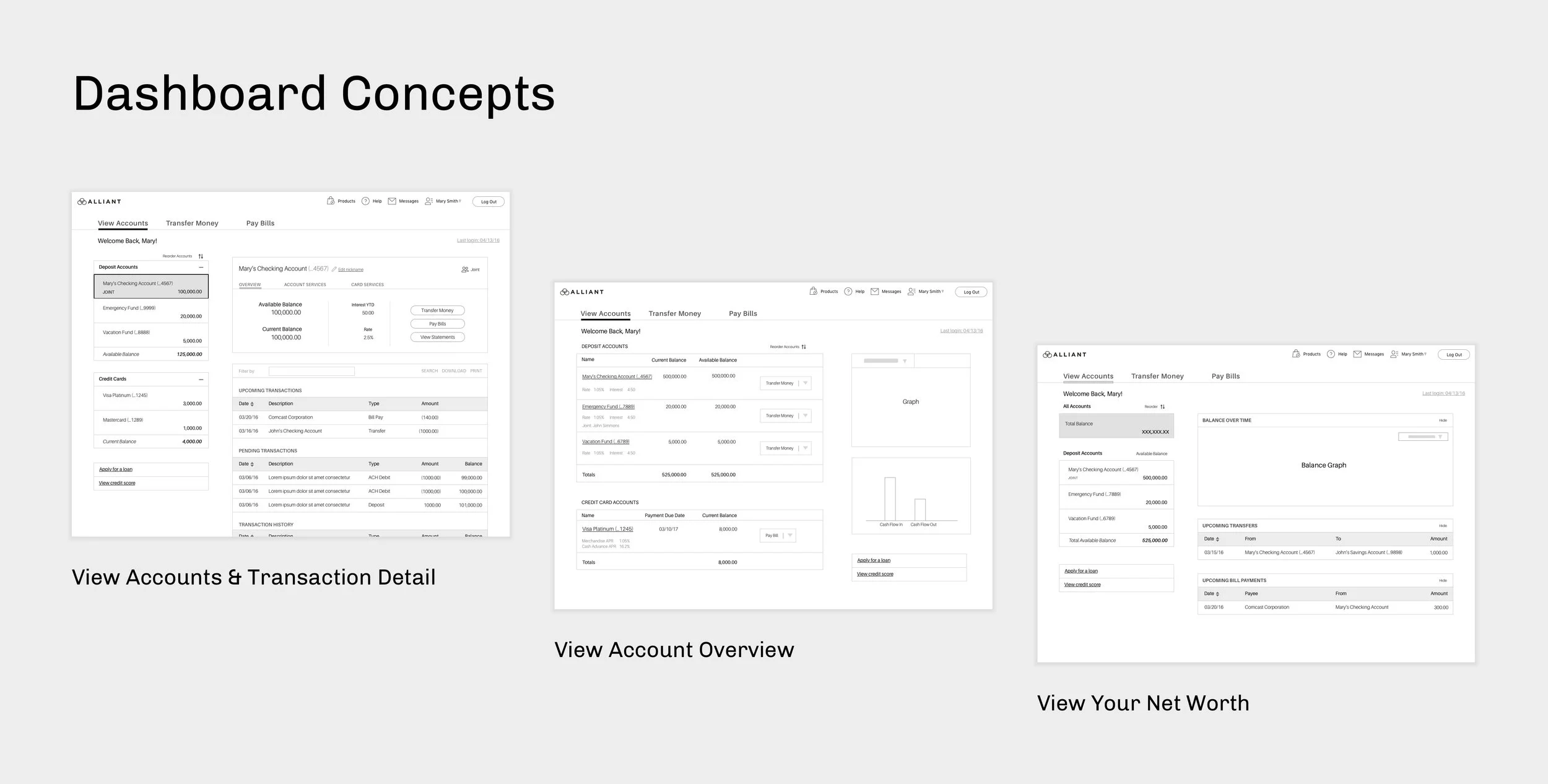
4 - Don't Assume - Test!
Concept Testing
I created new concepts for viewing accounts, paying bills, and transferring money by incorporating the new information architecture and conclusions from the competitive analysis. I created a clickable Invision prototype to walk users through the new flows to validate the new concepts.
We worked with a third party recruiting company to help us find participants that matched the client's primary and secondary personas. I contributed to a screener to weed out participants who did not fit the demographic and net worth requirements set by the client.
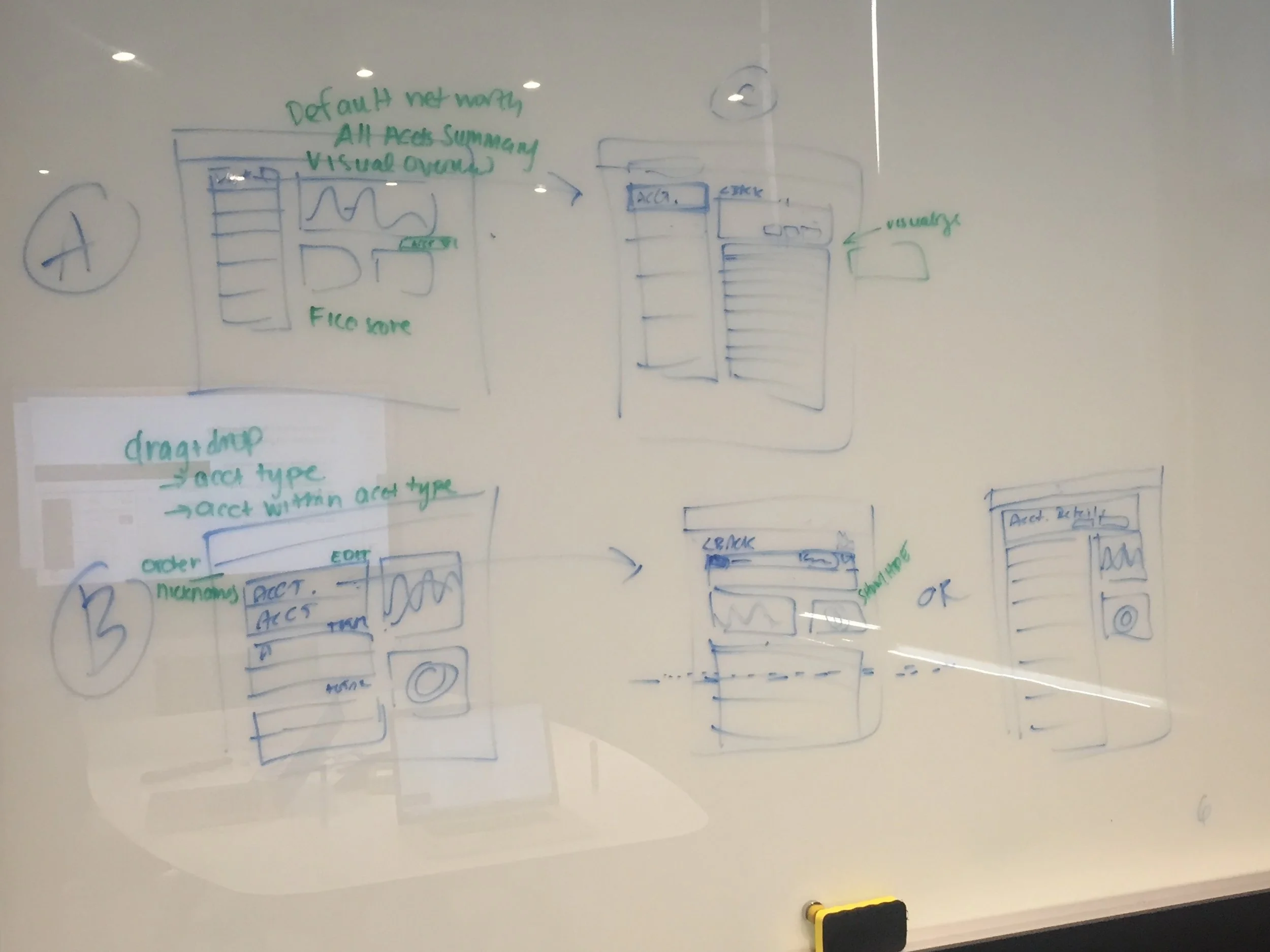
Sketches of Dashboard Concepts Influenced from the Competitive Analysis
users are biased until you switch it up
Initially, many of the users selected the dashboard concept that most represented their current experience. After an hour long session and a few printouts of the concepts they had seen earlier in the day, users preferred the dashboard concept that had the least number of clicks to view transactions.
Why did they change their mind?
At first, they felt overwhelmed two sides of the page being used for different things, but once it became more familiar to them, they valued its efficiency.

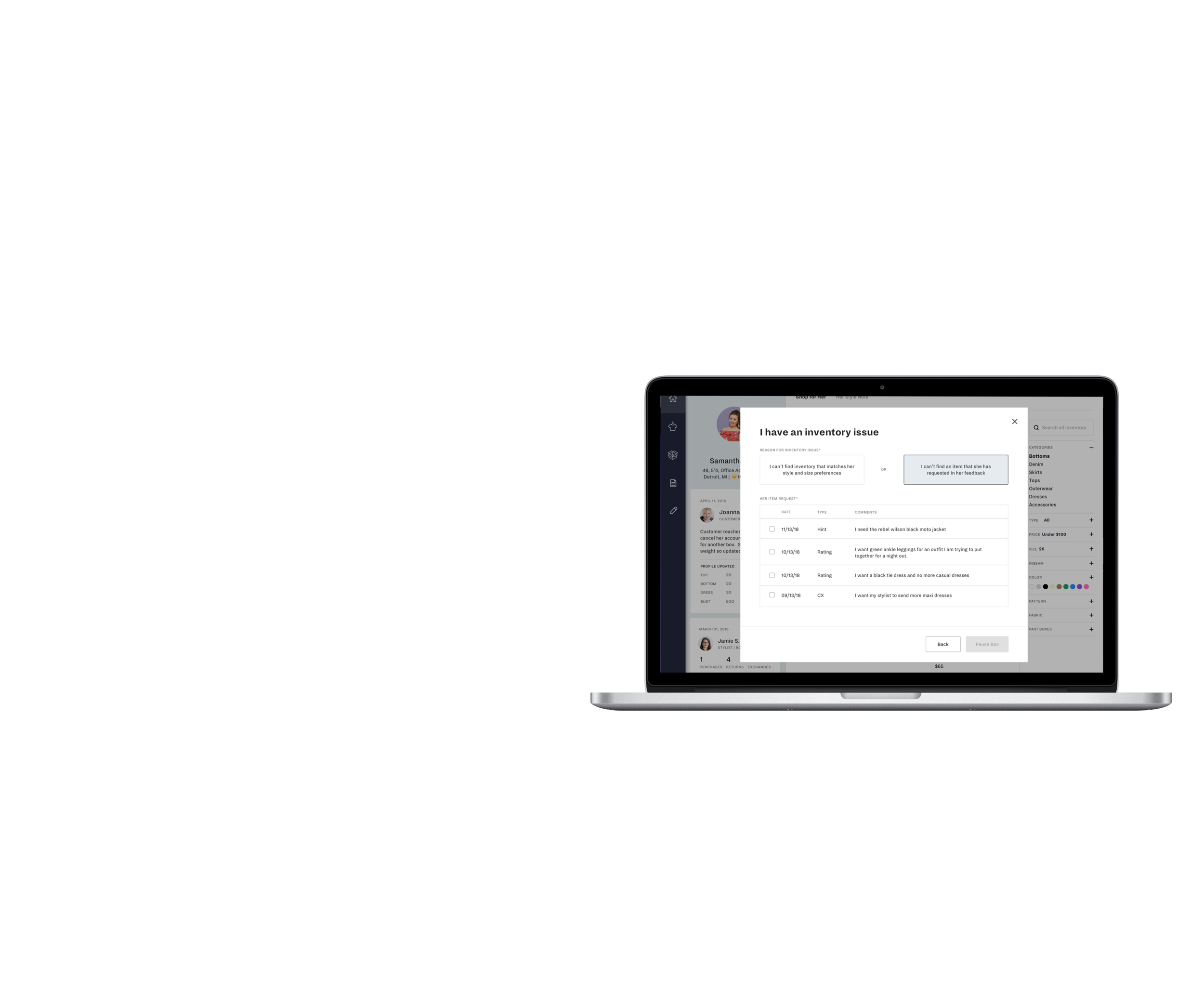
Refine Designs & Usability Testing
With the concepts validated by users, the product owner provided me with the top 10 pain points for each key area of the site. I used those to redesign detailed pages and user flows. From there, I wrote test case scenarios that emulated real life situations and provided printouts of bills to further encourage users to provide us with realistic responses.

The output of the usability testing resulted in the finalized designs in development slated for a 2019 release.
5 - Breaking it Down
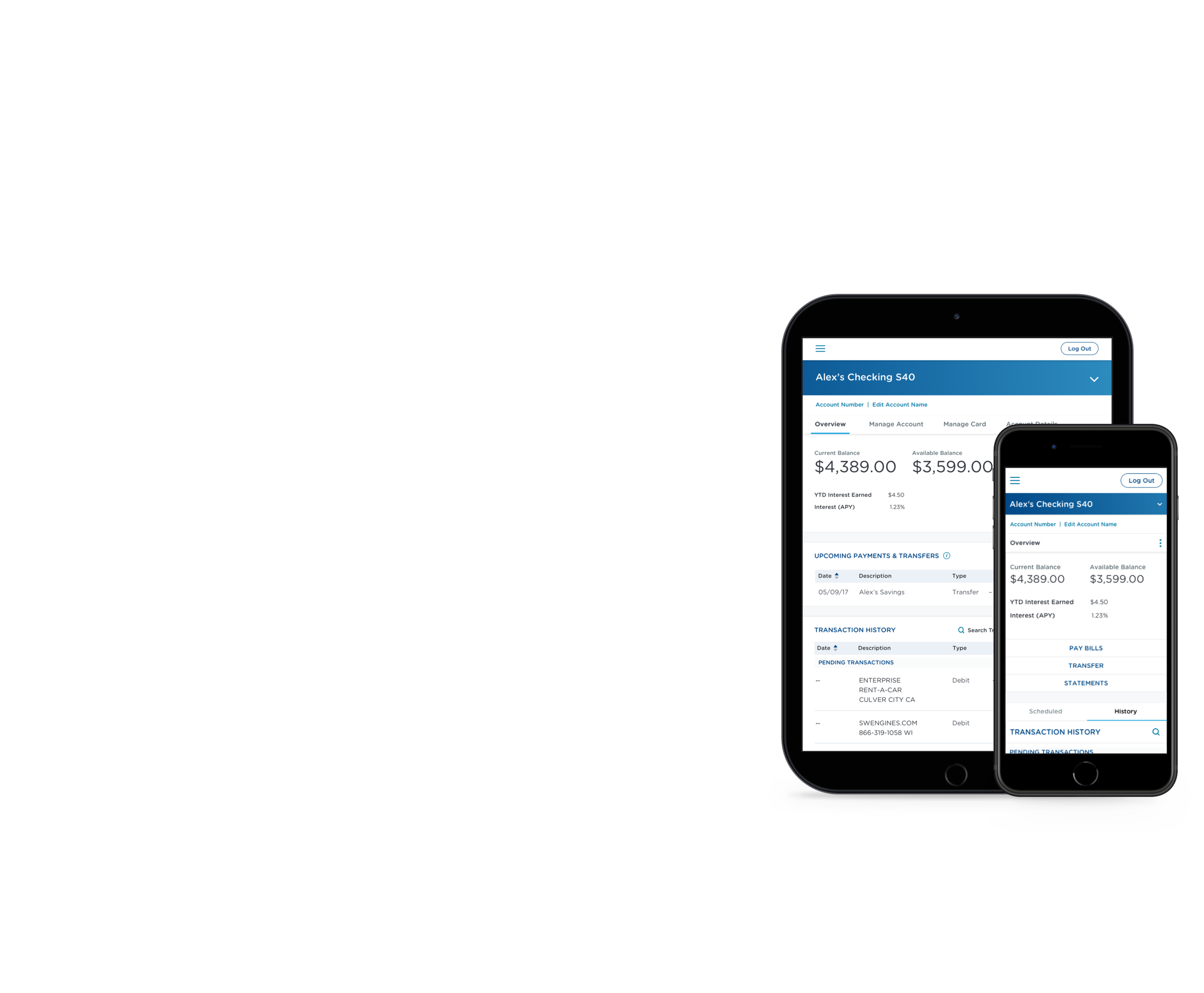
Once we had refined the designs after usability testing, we shifted our focus to our responsive breakpoints (360px, 768px, 1280px). These breakpoints were determined based on analytics data that the client had collected.


Responsive components across desktop, tablet, and mobile
The left navigation collapsed into a dropdown on tablet and mobile which resulted in a similar experience to desktop where you could view a list of your accounts and transaction details on one screen. The goal was to create scalable, reusable components that be could be used in multiple places in the re-design.
6 - Incorporating Accessibility into the Style Guide
Our team completed a full audit of approved mockups to define guidelines and rules for the style guide to ensure consistency for future designs.
Due to our client being in the financial sector, I did an accessibility check of the brand colors and found that it did not meet the 4:1 contrast ratio set by the world wide web consortium (W3C), a governing body responsible for the accessibility guidelines that the federal government currently abides to. I used a color checker to find shades of the brand colors that could be safely used for web and received approval to use those colors moving forward.
There are other accessibility considerations. As you can see in the mockups above, field labels are directly above inputs to ensure that a user doesn't have to search the page to find the label and they also don't have to memorize it (e.g in the cases where field labels are used as hint text inside a field, this increases the cognitive load on the user). One way to test that I analyzed if there was close enough grouping of related items was to conduct the straw test. I downloaded a bookmarklet that only allowed me to see a small diameter of the screen at a time to replicate the experience of users with low vision. From there, you can determine if you need to move certain functions to support those users.